Loading...
English
Bahasa Indonesia
Bahasa Melayu
Български
Català
Čeština
Dansk
Deutsch
Ελληνικά
English
Español
Français
Galego
한국어
हिन्दी
Italiano
Magyar
Македонски
Nederlands
Norsk
Polski
Português do Brasil
Română
Русский
Slovenščina
Suomi
Svenska
Tiếng Việt
Türkçe
Українська
中文
5mods on Discord
Show Adult
Content
Upload
Log In
Register
Search
Welcome to GTA5-Mods.com
Select one of the following categories to start browsing the latest GTA 5 PC mods:
Tools
Vehicles
Paint Jobs
Weapons
Scripts
Player
Maps
Misc
More
GTA 5 Cheats
Featured Files
See All
Mitsubishi Lancer Evolution X Final Edition [Add-On / Replace | FiveM | 270+ Tuning | Template]
v1.1
By
ElioMinati
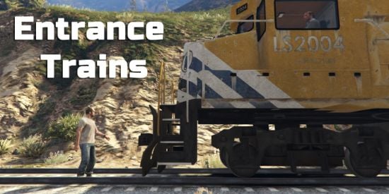
Entrance Trains
1.2
By
andre500
Fortnite Emotes in GTA 5
1.0
By
Victorch4
F-14A Tomcat Iranian Air Force [Add-On | VehFuncs V]
1.0
By
SkylineGTRFreak
Latest Files
See All
Animation
19
2
Duo-Trio Pack #1
By
MrWitt
Gameplay
Weapons
.Net
5.0
43
5
Custom Weapon Damage [.NET]
1.0
By
farusca
Add-On
5.0
11
1
Kenny (TWD: Season 3) [Add-On Ped]
1.0
By
Starfox1993
Assault Rifle
29
1
[INS2] H&K G3A3
1.0
By
Equinox407
5
1
[Livery] Boxville Bravado -Shopee Livery
By
AphinXn
Tattoo
20
1
Sanrio Tattoo
tattoo
By
shawtytoxicaf
Add-On
Car
Fictional
5.0
169
33
Base Model Coil Raiden [Add-On | LODs]
1.0
By
Skysder
Add-On
Car
Mclaren
5.0
542
12
2015 McLaren 570s [Addon]
1.0
By
Gx_Lover
Most Downloaded This Week
See All
Add-On
Car
Bmw
5.0
2,858
20
Bmw 320i F80
1.0
By
AtakanYilmazer
Add-On
Car
Mercedes-Benz
1,731
25
2021 Mercedes C-Class S206 Estate
V1.0
By
Jelfa
Add-On
Car
Ferrari
5.0
1,661
23
Ferrari Vision GT [Add-on | Unlocked | Template]
1.1
By
C6g3
Add-On
Car
Dodge
4.9
1,620
28
Dodge Challenger Hellcat Widebody 2021 [ Add-On / FiveM | Animated | Tuning ]
1.0
By
AboM7sn
Add-On
Car
Lore Friendly
Vanilla Edit
5.0
1,401
25
Annis Remus Widebody [Add-On|FiveM]
1.0
By
Silentm503
Add-On
Aircraft
Plane
Military Jet
Northrop Grumman
Featured
4.88
704
24
F-14A Tomcat Iranian Air Force [Add-On | VehFuncs V]
1.0
By
SkylineGTRFreak
Handgun
5.0
699
63
Vom Feuer Service Pistol (Pack) [Add-On | Animated | Tints | Lore-Friendly]
1.0
By
HeySlickThatsMe
Add-On
Car
Volkswagen
5.0
551
10
Volkswagen Scirocco 2008
By
AtakanYilmazer
![Mitsubishi Lancer Evolution X Final Edition [Add-On / Replace | FiveM | 270+ Tuning | Template]](https://img.gta5-mods.com/q95-w550-h275-cfill/images/mitsubishi-lancer-evolution-x-final-edition-270-tuning-liveries-add-on-fivem-replace/47e4e0-varis-1-min.png)

![F-14A Tomcat Iranian Air Force [Add-On | VehFuncs V]](https://img.gta5-mods.com/q95-w550-h275-cfill/images/f-14a-tomcat-iranian-air-force-add-on/50e265-7.jpg)
![Mitsubishi Lancer Evolution X Final Edition [Add-On / Replace | FiveM | 270+ Tuning | Template]](https://img.gta5-mods.com/q95-w170-h60-cfill/images/mitsubishi-lancer-evolution-x-final-edition-270-tuning-liveries-add-on-fivem-replace/47e4e0-varis-1-min.png)


![F-14A Tomcat Iranian Air Force [Add-On | VehFuncs V]](https://img.gta5-mods.com/q95-w170-h60-cfill/images/f-14a-tomcat-iranian-air-force-add-on/50e265-7.jpg)

![Custom Weapon Damage [.NET]](https://img.gta5-mods.com/q75-w500-h333-cfill/images/custom-weapon-damage/4dafe1-1233.jpg "Custom Weapon Damage [.NET]")
![Kenny (TWD: Season 3) [Add-On Ped]](https://img.gta5-mods.com/q75-w500-h333-cfill/images/kenny-twd-season-3-add-on-ped/7992d9-thumbnail.jpg "Kenny (TWD: Season 3) [Add-On Ped]")
![[INS2] H&K G3A3](https://img.gta5-mods.com/q75-w500-h333-cfill/images/ins2-h-k-g3a3/4256d2-0.jpg "[INS2] H&K G3A3")
![[Livery] Boxville Bravado -Shopee Livery](https://img.gta5-mods.com/q75-w500-h333-cfill/images/test-aphinxn/a5495c-1.jpg "[Livery] Boxville Bravado -Shopee Livery")

![Base Model Coil Raiden [Add-On | LODs]](https://img.gta5-mods.com/q75-w500-h333-cfill/images/base-model-coil-raiden-add-on-lods/a492bd-enb2024_1_21_23_12_28_46_1_75.png "Base Model Coil Raiden [Add-On | LODs]")
![2015 McLaren 570s [Addon]](https://img.gta5-mods.com/q75-w500-h333-cfill/images/2015-mclaren-570s-addon/ee432a-6.png "2015 McLaren 570s [Addon]")


![Ferrari Vision GT [Add-on | Unlocked | Template]](https://img.gta5-mods.com/q75-w500-h333-cfill/images/ferrari-vision-gt-add-on-unlocked/7bf0e6-1.png "Ferrari Vision GT [Add-on | Unlocked | Template]")
![Dodge Challenger Hellcat Widebody 2021 [ Add-On / FiveM | Animated | Tuning ]](https://img.gta5-mods.com/q75-w500-h333-cfill/images/dodge-challenger-hellcat-widebody-2021-add-on-fivem-animated-tuning/b581ea-AboM7sn(1).png "Dodge Challenger Hellcat Widebody 2021 [ Add-On / FiveM | Animated | Tuning ]")
![Annis Remus Widebody [Add-On|FiveM]](https://img.gta5-mods.com/q75-w500-h333-cfill/images/annis-remus-widebody-add-on-fivem/fb4694-remus6.jpg "Annis Remus Widebody [Add-On|FiveM]")
![F-14A Tomcat Iranian Air Force [Add-On | VehFuncs V]](https://img.gta5-mods.com/q75-w500-h333-cfill/images/f-14a-tomcat-iranian-air-force-add-on/50e265-7.jpg "F-14A Tomcat Iranian Air Force [Add-On | VehFuncs V]")
![Vom Feuer Service Pistol (Pack) [Add-On | Animated | Tints | Lore-Friendly]](https://img.gta5-mods.com/q75-w500-h333-cfill/images/vom-feuer-service-pistol-pack-add-on-animated-tints-lore-friendly/9787d1-Title-min.png "Vom Feuer Service Pistol (Pack) [Add-On | Animated | Tints | Lore-Friendly]")

 5mods on Discord